Wednesday, December 19, 2012

Disproportional

     The point of this project was to make images that are disproportional.  This image I used the free transform tools to change the sizes of the kitten and the yarn.  The yarn was made to look much bigger than the kitten instead of the other way around like it is in reality.

Tuesday, December 18, 2012

Hands

     This project was done using images that we took.  The point of the pictures was to take images of people's hands.  After we had uploaded the pictures, we edited them to make them look better.  There were four different edits that I did.  The one shown above is the cool edit which makes the image look blue toned. To do this, I had to add an adjustment layer, choose color balance, and then change the settings.  There are different settings for each photo.  The next two are a warm filter and an emerald filter.  Warm makes photos look red or yellow and emerald is a mix between warm and cool, it looks blue and green.

     The black and white looking image above has a gradient map edit.  I just added a new adjustment layer and chose gradient map instead of color balance.

Thursday, December 13, 2012

David Hockney

     This project is called "David Hockney" because we were supposed to recreate a David Hockney style photo.  A David Hockney style photo uses many different images of the same thing put together to look like the one scene all together.  To do this on the computer, we had to choose an image we liked, and then break it apart.  To break it apart we first selected part of the image, made it black, added a white background to them, and added a few extra layers.  After that I just copied the layers I used to make the polaroid looking image to make it look as it does above.  I made two photos for this project.

Wednesday, December 12, 2012

Movie


     For this project, we made a video instead of a photo.  First, we chose a photographer who we really liked, and saved at least ten of our favorite images taken by them.  Then we used the Windows Movie Maker to add the photos to a movie, add credits, and music to go along with the video.  The video above is the finished product.

Monday, December 10, 2012

Skin Softening, Teeth Whitening, and Vivid Eyes

     The point of this project was to fix images to make them look better.  This image practiced using the skin softening tools.  To do this, there are a few steps I had to do.  First, I had to use a skin perfecting tool of my choice.  I chose to use the patch tool where you circle what you want to perfect and drag it to somewhere with a matching skin tone to fix it.  Next, I duplicated the background layer and changed the blend mode to overlay.  Then I added a high pass filter which makes it much more saturated and bright.  Next I had to invert this so it softened the picture.  Last, I added a layer mask to make the key parts of the face less soft (such as her eyes, mouth, and hair).
     I also used the same process as I did on the last one on this photo.  The only thing I did differently was make her eyes more vivid.  To do this, I selected her eyes with any tool of my choice then added more hue, saturation, and color.  Her eyes were changed from blue to more greenish and bright.
     This image has whitened teeth.  To do this, I first applied the selective color layer.  Then, I chose yellow from the drop down menu and slid the yellow slider all the way to the left.  Next I had to invert what I had just done so it looked how it originally did.  After that, I used the brush to paint the teeth to make them look white and the rest of the picture remain the same.
     I edited this image with all three techniques that I explained above.

Tuesday, December 4, 2012

Lights

 
 To do this project, we were using the tool we were just introduced to called the pen tool.  First, we had to set the brush to the size we wanted, then we used the pen tool to create a path that looked like an "s." Once we had done that, we duplicated the s and turned it so what we had drawn looked like an eight.  Then I made a glow on the eight and duplicated the layer many times and spun it a little bit every time so that the finished product looked as it does above.
     This second image used the same tool to make the long lines coming from the plant.  I used the same technique and added a glow.  Then I used a small brush to make dots looking like they come from the lines, using the same color.
     This last image is one that I decided to make on my own using the same technique as the first image.

Tuesday, November 27, 2012

Portraits

     The point of this photo was to make a real picture look like it was painted or drawn.  To do this, first I had to duplicate the layer.  Next, I went to the sketch tab, and selected photocopy.  This made the image black and white but looked like it was drawn or painted.  The last step was to select overlay for how the image appears, and this adds color back into the image.  This is the final product.
     This image is supposed to look cross processed.  To do this, I had to change the curves settings by choosing the curves tab, then changing the red, green, and blue settings.  That made the image look a little different.  Then I had to add a yellow layer on top and change the opacity so it looked as it does above.
     The two images above were made using custom shape.  This is done by selecting part of a normal photo and making it black (like a silhouette) in the first image.  I then saved the black part as a custom shape and used it to make the second image.  I made a background, then added a black and white version of my shape.
     This last image was just edited in camera raw.  I lightened it a little bit because the original had lots of shadows that made it hard to see her face.  I then just changed the saturation and colors a little bit to make it look as it does above.


Monday, November 19, 2012

Reflection

     For this project, we could choose any kind of reflection we wanted and find out a way to make it.  I just chose a normal reflection which takes one part of an image and flips it so there is a symmetrical image with both halves looking exactly the same.  To do this I first found a picture that I wanted.  Once that was done, I selected the part of the image I wanted to reflect, copied it, then flipped the copy horizontally so it looked as it does above.  Those are the only three steps to do this.
      I repeated the same process for the second photo.

Friday, November 16, 2012

Collage

     This project was about making collages.  First we chose an artist and collage that they made that we wanted to replicate.  I chose Kelly Provo and used the same idea as most of her collages.  I found an outline of a house then filled it in with different photos to create the collage look.  Then I found a background and got smoke to come out of the chimney.

Friday, November 9, 2012

Carter's Mountain Photo Edits


     For this part of the project, I just had to add effects to pictures I'd taken.  I added black and white to both and different filters as well to change the color a little bit.


     For the next part, we color corrected images to make them look brighter and just better overall.  We had to set some settings and then select the parts of the picture that were darkest, lightest, and in the middle.  It then automatically adjusts the photo.
     The ginal part of the project was to adjust a photo any way we wanted and add text.  I just used the text tool, wrote something that advertised the photo.  I then chose the font and font color that I wanted and I was finished.

Wednesday, November 7, 2012

Typography

     For this project, we were supposed to use any fonts that we wanted to create an image.  I chose a hand and used I's and U's to make the outer shape, then typed random words and arranged them inside the hand.

Thursday, November 1, 2012

Dafont

      For this project, we used the dafont website to choose fonts to use in pictures.  We chose the fonts we liked and downloaded them.  We then used the font to type words and add vector images to them.  We had to make sure the images flowed together.

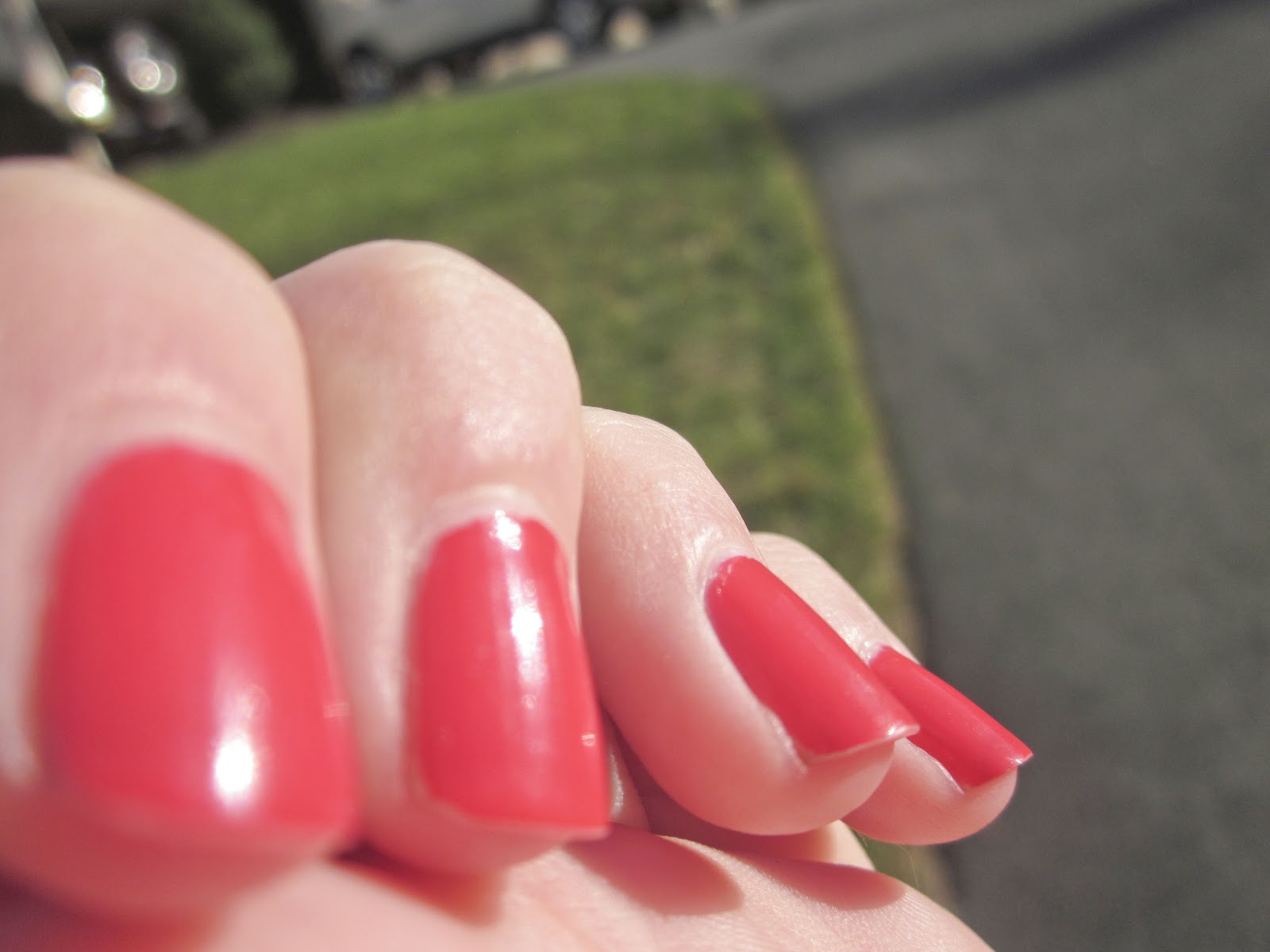
Monday, October 15, 2012

Macro Photography & Sharpening


     For this project, we used images from our last shooting assignment.  The assignment was to take photos using the macro setting on our cameras also called macro photography.  These are images that are very sharp and often include patterns and line.  Once we uploaded these images, our task was to sharpen them.  All I did was, for each image, copy the layer and name the new layer sharp.  Then I set this layer to the overlay setting.  This make the image look brighter and a little sharper.  Next I sharpened the photo by going into the filter tab, selecting other, and then choosing the setting that I wanted.  I made the image the sharpness I wanted and saved.

Thursday, October 11, 2012

Visual Puns

     For this project, we were using all of the tools we have learned about previously to create images.  The images had to be visual puns.  For example, the image above is a crab apple.  So I quick selected parts of a crab and added them to the image of the apple.  Once I was done with that I added a background.
     I used the same process on this photo and made sure to refine all of the edges while I was working.  This shows a home run.

     This image is a tooth pick.

Tuesday, October 9, 2012

Rule of Thirds

     For this project, we were using photos we took to add certain effects.  On this one I used the whites tool.  To do this I clicked on the tool and moved it onto the whitest column, clicked on it, and it fixed everything all by itself.

     For this image I used the vignette tool.  This can make the edges around the picture darker or lighter.  I chose to make them darker and changed the center of the image so that it covered most of the picture besides the leaf.
     For this one, I used the fill light tool.  This lightens parts of the pictures that need more light.
     This used the exposure tool.  This makes the dark parts of the image lighter to brighten it up.
     For this image, I used the clarity tool.  This sharpens up the picture and makes it look very focused.
     This image was fixed using the blacks tool.  It darkens parts of the picture that have too much light and makes it look a little more realistic.

Friday, October 5, 2012

Jumping off the Page

     For this project, we were trying to make it look three dimensional.  So I had to select the photo I wanted to use (the swimmer) and selected it and put it onto the page.  I then used the rectangle tool to make a box which I covered with the swimming lanes.  To make the shadow on the box, I used the drop shadow tool by double clicking on the layer and choosing how much of a shadow I wanted.  To put the shadow behind the swimmer, I made another copy of the photo, filled it black, and then added the gaussian blur on it.  I then positioned everything how I wanted and merged the layers.

Tuesday, October 2, 2012

Painting

     For this part of the project, we used our own painting to make a kaleidoscope.  I used the various brushes to create the image I wanted.  I made sure to create a new layer for each new part of the painting.  There are different settings for the brushes that can scatter the stamps/brushes.  This is the only adjustment I made to the settings.  After I had the painting the way I wanted it, I repeated the exact same steps I used in the last part of the project to create a kaleidoscope look.

Monday, October 1, 2012

Kaleidoscope

   
      For this project, we were trying to make an image that looked like a kaleidoscope.  To do this I chose an image I wanted to use, and cropped it so that it was a 5x5.  Next I flipped it forty five degrees so that it looked like a square diamond.  Then I had to use the rectangular marquee tool to select the side of the picture I wanted to delete.  I deleted that section and then made a copy of the side that I kept and flipped it horizontally.  I made sure to line the two sides up perfectly.  Then I put the blue guides crossing over the image so that it was easier to select the sections I wanted to work with.  Going around all four corners, copied each corner and flipped the new selection, flipped it horizontally, and then lined it up to the corner of the image.   I had to repeat that process for all four corners of the image.  Next, I created a new document that was a 14x14.  I moved the image that I had already made (with all of the layers merged) onto the new document.  I then copied the image three times and flipped one of the copies horizontally and two of them vertically.  Then I lined them all up to each other.  The last step was merging the layers and using the hue and saturation tool to change the color of the image.