This is a link to a portfolio of some of my favorite photos from this semester.
P:\Meade\12-13\Digital Imaging 1\Finished_2nd Nine Weeks\Due 1-11_Finished_Digital Portfolio\Grace Goodwin's Portfolio\index.html
Friday, January 11, 2013
Wednesday, January 9, 2013
Photo Aging

Tuesday, January 8, 2013
Shapes
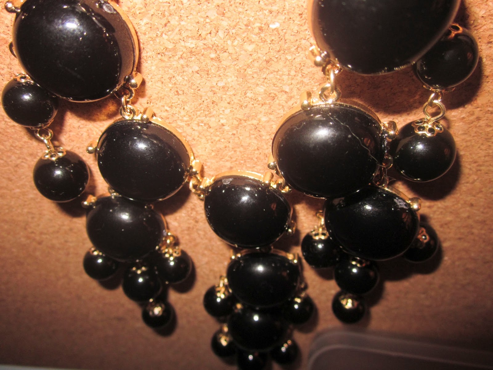
Over our winter break, we had an assignment to take photos of things with shapes. Then, we edited five of them in camera raw to make them look perfect. These are the five I edited.


Once I had nicely edited the photos above, I made a collage out of some of the photos I took for the assignment. To do this, all I did was create a new document and resize and arrange the pictures I wanted to use in the collage.

Wednesday, December 19, 2012
Disproportional

Tuesday, December 18, 2012
Hands


Thursday, December 13, 2012
David Hockney

This project is called "David Hockney" because we were supposed to recreate a David Hockney style photo. A David Hockney style photo uses many different images of the same thing put together to look like the one scene all together. To do this on the computer, we had to choose an image we liked, and then break it apart. To break it apart we first selected part of the image, made it black, added a white background to them, and added a few extra layers. After that I just copied the layers I used to make the polaroid looking image to make it look as it does above. I made two photos for this project.

Wednesday, December 12, 2012
Movie
For this project, we made a video instead of a photo. First, we chose a photographer who we really liked, and saved at least ten of our favorite images taken by them. Then we used the Windows Movie Maker to add the photos to a movie, add credits, and music to go along with the video. The video above is the finished product.
Subscribe to:
Posts (Atom)