Monday, October 15, 2012

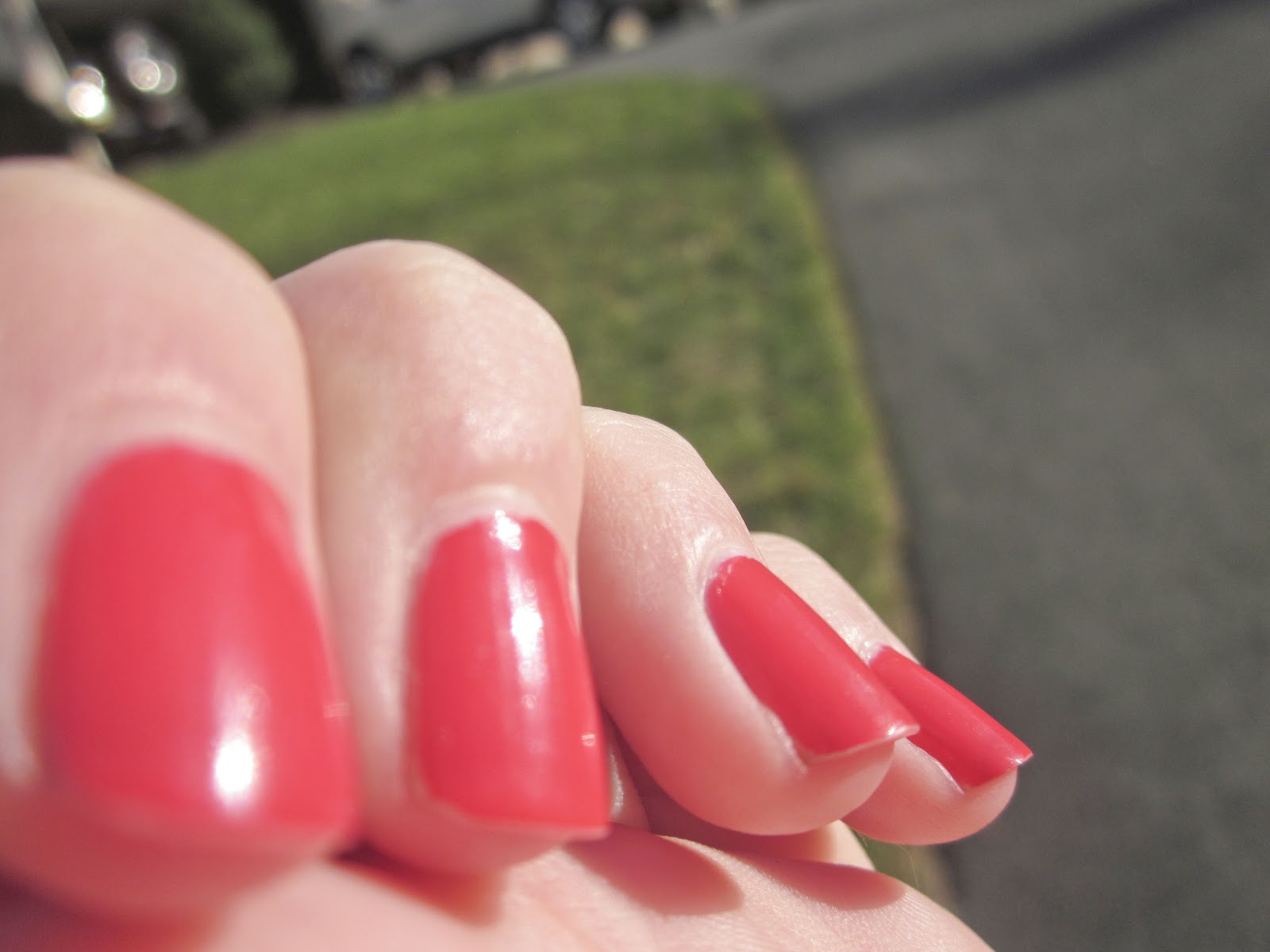
Macro Photography & Sharpening


     For this project, we used images from our last shooting assignment.  The assignment was to take photos using the macro setting on our cameras also called macro photography.  These are images that are very sharp and often include patterns and line.  Once we uploaded these images, our task was to sharpen them.  All I did was, for each image, copy the layer and name the new layer sharp.  Then I set this layer to the overlay setting.  This make the image look brighter and a little sharper.  Next I sharpened the photo by going into the filter tab, selecting other, and then choosing the setting that I wanted.  I made the image the sharpness I wanted and saved.

Thursday, October 11, 2012

Visual Puns

     For this project, we were using all of the tools we have learned about previously to create images.  The images had to be visual puns.  For example, the image above is a crab apple.  So I quick selected parts of a crab and added them to the image of the apple.  Once I was done with that I added a background.
     I used the same process on this photo and made sure to refine all of the edges while I was working.  This shows a home run.

     This image is a tooth pick.

Tuesday, October 9, 2012

Rule of Thirds

     For this project, we were using photos we took to add certain effects.  On this one I used the whites tool.  To do this I clicked on the tool and moved it onto the whitest column, clicked on it, and it fixed everything all by itself.

     For this image I used the vignette tool.  This can make the edges around the picture darker or lighter.  I chose to make them darker and changed the center of the image so that it covered most of the picture besides the leaf.
     For this one, I used the fill light tool.  This lightens parts of the pictures that need more light.
     This used the exposure tool.  This makes the dark parts of the image lighter to brighten it up.
     For this image, I used the clarity tool.  This sharpens up the picture and makes it look very focused.
     This image was fixed using the blacks tool.  It darkens parts of the picture that have too much light and makes it look a little more realistic.

Friday, October 5, 2012

Jumping off the Page

     For this project, we were trying to make it look three dimensional.  So I had to select the photo I wanted to use (the swimmer) and selected it and put it onto the page.  I then used the rectangle tool to make a box which I covered with the swimming lanes.  To make the shadow on the box, I used the drop shadow tool by double clicking on the layer and choosing how much of a shadow I wanted.  To put the shadow behind the swimmer, I made another copy of the photo, filled it black, and then added the gaussian blur on it.  I then positioned everything how I wanted and merged the layers.

Tuesday, October 2, 2012

Painting

     For this part of the project, we used our own painting to make a kaleidoscope.  I used the various brushes to create the image I wanted.  I made sure to create a new layer for each new part of the painting.  There are different settings for the brushes that can scatter the stamps/brushes.  This is the only adjustment I made to the settings.  After I had the painting the way I wanted it, I repeated the exact same steps I used in the last part of the project to create a kaleidoscope look.

Monday, October 1, 2012

Kaleidoscope

   
      For this project, we were trying to make an image that looked like a kaleidoscope.  To do this I chose an image I wanted to use, and cropped it so that it was a 5x5.  Next I flipped it forty five degrees so that it looked like a square diamond.  Then I had to use the rectangular marquee tool to select the side of the picture I wanted to delete.  I deleted that section and then made a copy of the side that I kept and flipped it horizontally.  I made sure to line the two sides up perfectly.  Then I put the blue guides crossing over the image so that it was easier to select the sections I wanted to work with.  Going around all four corners, copied each corner and flipped the new selection, flipped it horizontally, and then lined it up to the corner of the image.   I had to repeat that process for all four corners of the image.  Next, I created a new document that was a 14x14.  I moved the image that I had already made (with all of the layers merged) onto the new document.  I then copied the image three times and flipped one of the copies horizontally and two of them vertically.  Then I lined them all up to each other.  The last step was merging the layers and using the hue and saturation tool to change the color of the image.


Wednesday, September 26, 2012

Tool review

     This project was to review all of the tools we have used previously.  I chose five photos that I'd taken that I wanted to put on the background (fence) and used different methods to cut them out and make them look good.  I used the quick selection tool to cut out both people by starting in the middle of them and going outward.  I then refined the edge to make it look a little smoother.  I have to do this after cutting everything else out too.  I used the elliptical marquee tool to cut out the flower.  I made a circle and moved it over the flower by holding the space bar.  I used the polygonal lasso tool to cut out the sign on the fence.  I started in a corner and drew straight lines to all of the edges until I was back where I started.  The magic wand tool was used to cut out the tree branch in the corner.  I just clicked on the branch and it selected the whole thing.  The layer mask tool is used to cover up part of pictures I didn't want showing.  I just used the paint brush and the black color to do this.  I had to make sure to resize the image as well.